Amongst other things, the municipality of Zoetermeer supports its residents whose income is lower than average. They do this by providing a budget, so its residents can join sports, the library or do other activities for free or a reduced fee.
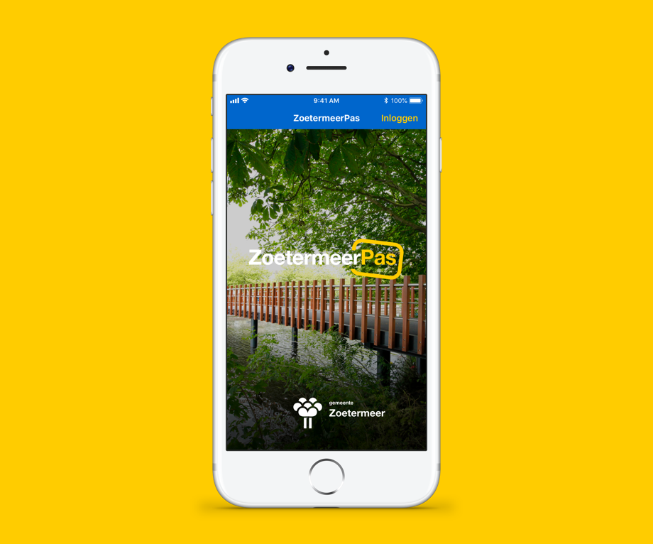
For quite some time, they have had a voucher system in place. This system is called Zoetermeerpas. It was in need of a refresh. Vouchers would get lost, misused and the administration was all manual. The municipality of Zoetermeer put out a tender for a new digital Zoetermeerpas system, which was won by Visma Connect.
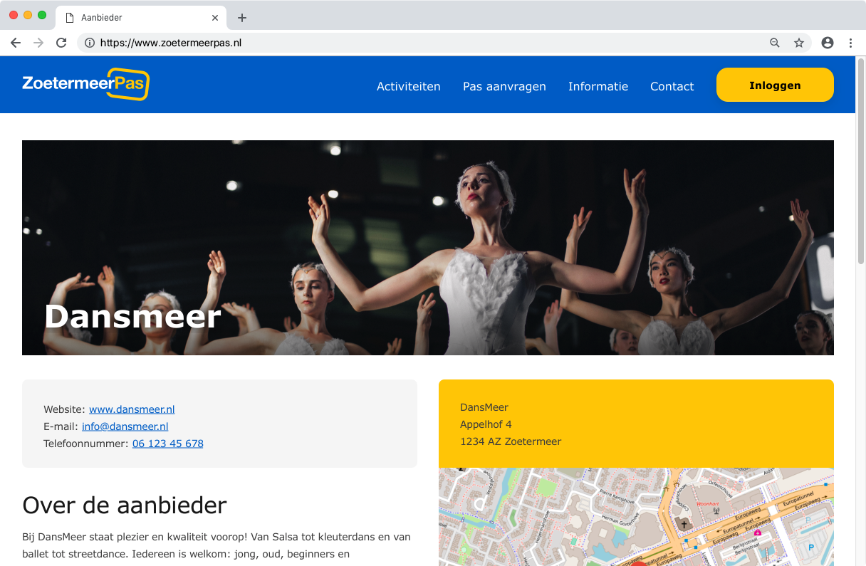
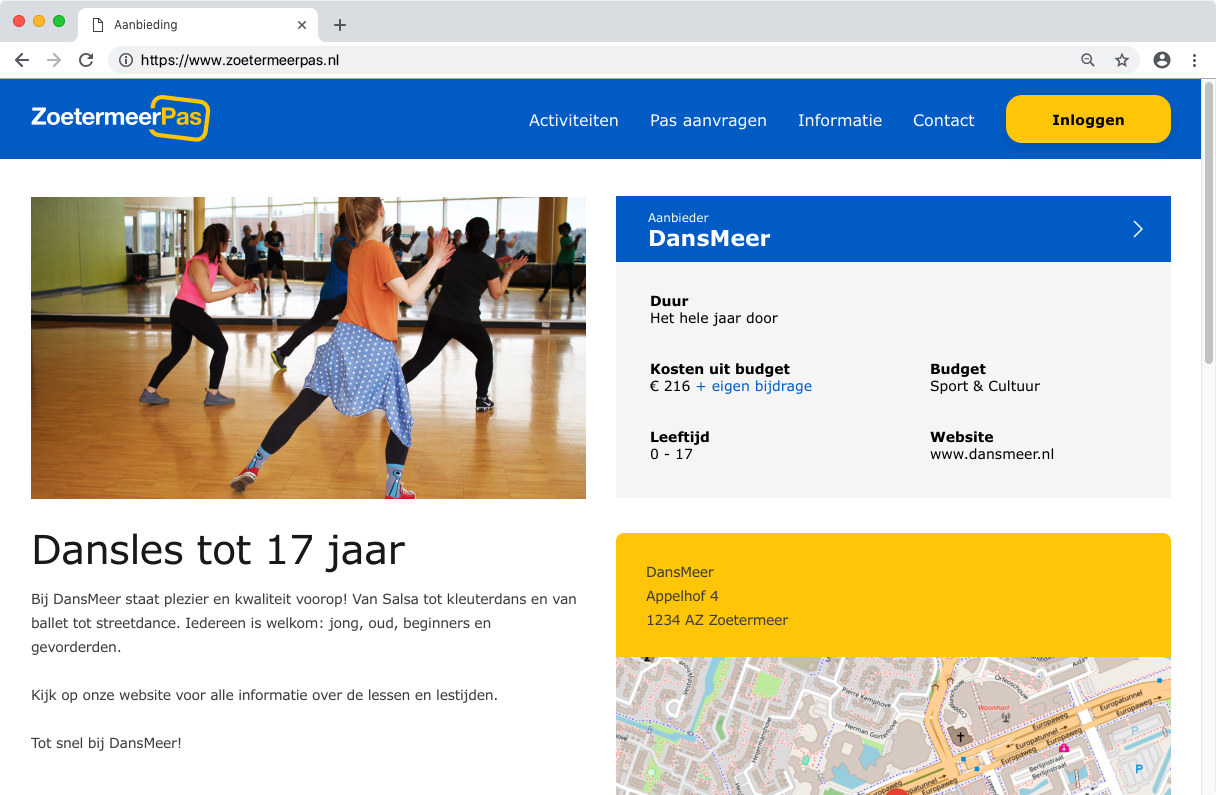
In comes the digital age. A new secure way to make transactions was set up. The new website made it possible for the municipality to set up the budgets and approve and deny new applications for companies, institutions and others wanting to participate.
Companies are able to set up company pages and make activity pages with information about costs.
Residents are able to search for activities they can do for a reduced fee or free and check their current budget and budget spendings. However..
Not all residents with a low income have a computer at home. Some have problems reading, some don't know how to use a computer. Often times these things are forgotten in a project where all transactions happen digitally. With ZoetermeerPas we thought of a way to make sure people can use the website if they want, but the use is not mandatory. The municipality has employees that will help out if you want to find activities or want more information about your budget and spendings.
You can happily use the ZoetermeerPas without ever using a computer, yet everything in the background will still happen digitally. You don't have to read a lot either, but all text was written according to a Dutch reading level standard that is easy to understand for everyone, just in case.
I started from scratch, mostly. Obviously there were some guidelines and rules when it comes to colour and typography, but it was pretty much up to me next to that.
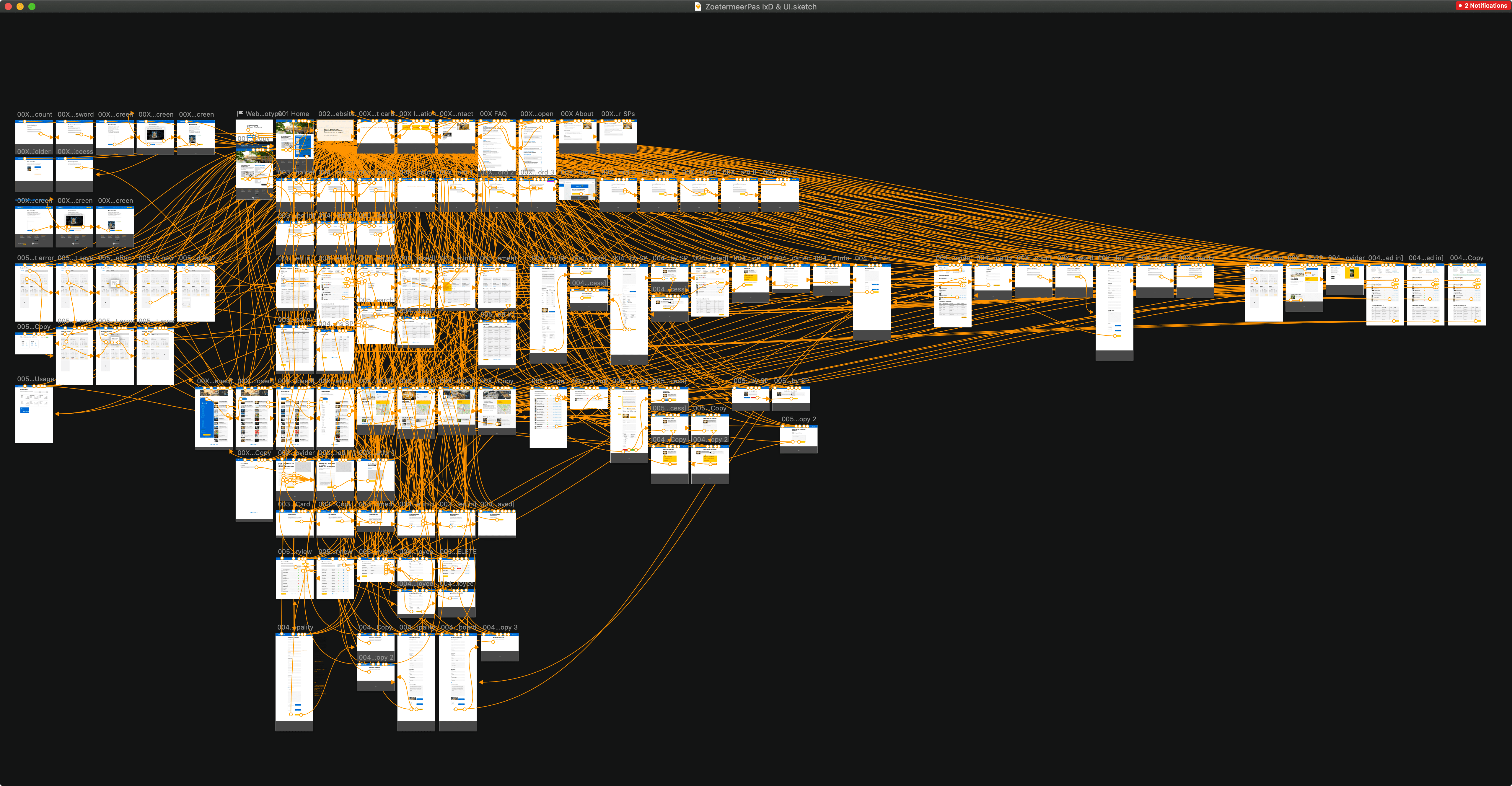
The process was mostly figuring out what we need. This started with some sketches on paper during meetings, which turned into quite extensive low fidelity iterations. The final prototype was quite large, with 125 clickable artboards for the website alone.
While the general design language for the project was done, it wasn't completely implemented. You can find the current website on zoetermeerpas.nl.
A smaller part of the project was the design for a mobile app. It's not an app for the residents (They can use the responsive website), but an app used for scanning the cards of the residents to confirm the use of a service.
I got the freedom to make a simple logo for this project. I felt it needed one for the branding of the website, but also for the app and the physical card. It would eventually also be used for marketing purposes. This gave me a lot of joy and the response was really good.
I designed multiple versions of the physical card, which we printed to see how they would look in a real life size. There were some ideas that would fit the logo in a fun way, but in the end we chose a simple and understandable design.